> ## Documentation Index
> Fetch the complete documentation index at: https://launchdarkly-preview.mintlify.site/llms.txt
> Use this file to discover all available pages before exploring further.
# Dashboards
> This topic explains how to use dashboards in LaunchDarkly observability.
> For the complete documentation index, see [llms.txt](/llms.txt). For the full documentation snapshot, see [llms-full.txt](/llms-full.txt).
## Overview
This topic explains how to use dashboards in LaunchDarkly observability.
Dashboards let you visualize what's happening in your app. They can show error rates, APM trends, user engagement, and more. Dashboards are comprised of graphs, which are visualizations of data that you can create and configure to show the data you want.
LaunchDarkly provides two types of dashboards:
* **Default dashboards**: Pre-configured dashboards that provide immediate visibility into frontend, backend, and LLM application performance. You cannot edit, create, or delete default dashboards, but they automatically populate with data when you have the required integrations.
* **Custom dashboards**: Fully customizable dashboards that you can create, edit, and delete to meet your specific reporting needs.
To visualize service-to-service dependencies derived from your traces data, read [Service map](/home/observability/service-map).
## Default dashboards
Default dashboards provide out-of-the-box observability for your applications without any configuration. To access default dashboards, navigate to **Observability > Dashboards** in the LaunchDarkly UI. The default dashboards will appear automatically once you have the required integrations configured and data is flowing.
There are three default dashboards available:
### Frontend default dashboard
The frontend default dashboard monitors client-side application performance and user experience metrics. This dashboard includes three tabs:
\| Tab
\| Required Integration
| Documentation |
| - |
\| ---
\| --- |
\| Overview
\| JS Observability Plugin + JS Session Replay Plugin
\| [JavaScript Observability SDK](/sdk/observability/javascript) |
\| Web Vitals
\| JS Observability Plugin
\| [JavaScript Observability SDK](/sdk/observability/javascript) |
\| Resources
\| JS Observability Plugin
\| [JavaScript Observability SDK](/sdk/observability/javascript) |
### Backend default dashboard
The backend default dashboard monitors server-side application performance, including API endpoints and database queries. This dashboard includes two tabs:
\| Tab
\| Required Integration
| Documentation |
| - |
\| ---
\| --- |
\| Overview
\| Server-side SDK with traces OR OpenTelemetry with span\_kind=Server attribute
\| [Observability SDKs](/sdk/observability#observability-sdks) |
\| Queries
\| Server-side SDK with database instrumentation OR OpenTelemetry traces with span\_kind=Client and{' '} db.system attributes
\| [Observability SDKs](/sdk/observability#observability-sdks) or{' '} [OpenTelemetry server-side](/sdk/features/opentelemetry-server-side#sending-opentelemetry-data-to-launchdarkly) |
### LLM Agent default dashboard
The LLM Agent default dashboard monitors the performance and usage of large language model (LLM) calls in your application. This dashboard requires traces with `gen_ai.*` semantic convention attributes, such as `gen_ai.operation.name`, `gen_ai.request.model`, and `gen_ai.usage.input_tokens`.
Server-side SDK or OpenTelemetry traces with `gen_ai.*` semantic convention attributes. To learn more, read [Observability SDKs](/sdk/observability#observability-sdks).
The dashboard displays:
* Token usage over time, broken down by input and output tokens
* LLM call rate and error rate
* Latency metrics, including average and P95
* A models table showing model name, provider, call count, token usage, duration, and error rate. Clicking a row opens Related Resources filtered to that model.
* A tools table showing tool name, execution count, duration, and error rate. Clicking a row opens Related Resources filtered to that tool.
## Custom dashboards
Custom dashboards are fully customizable dashboards that you can create, edit, and delete to meet your specific reporting needs. Unlike default dashboards, you have full control over the graphs, layout, and configuration of custom dashboards.
### Create a custom dashboard
Here's how to create a custom dashboard:
1. In the LaunchDarkly UI, click **Dashboards** in the left sidenav.
2. Click **Create new dashboard**.
3. Give your dashboard a human-readable **Name**.
4. Click the dropdown to choose the **Dashboard type**:
* A **Blank dashboard** is initially empty. Use the [Add graphs to a custom dashboard](#add-graphs-to-a-custom-dashboard) procedure, below, to populate it.
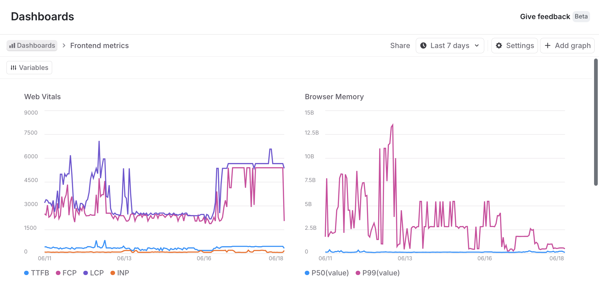
* A **Frontend metrics** dashboard is configured to include graphs for web vitals, browser memory, HTTP response size, HTTP request size, HTTP errors, and HTTP request latency.
5. Click **Create**.
The new dashboard appears. For each **Dashboard type**, you can customize or remove graphs, and add additional graphs, to meet your reporting needs.
### Add graphs to a custom dashboard
You can add graphs to a dashboard to visualize different data.
First, name the graph and specify how you want the data to display. Here's how:
1. In a dashboard, click **+ Add graph**. The "New graph" page appears.
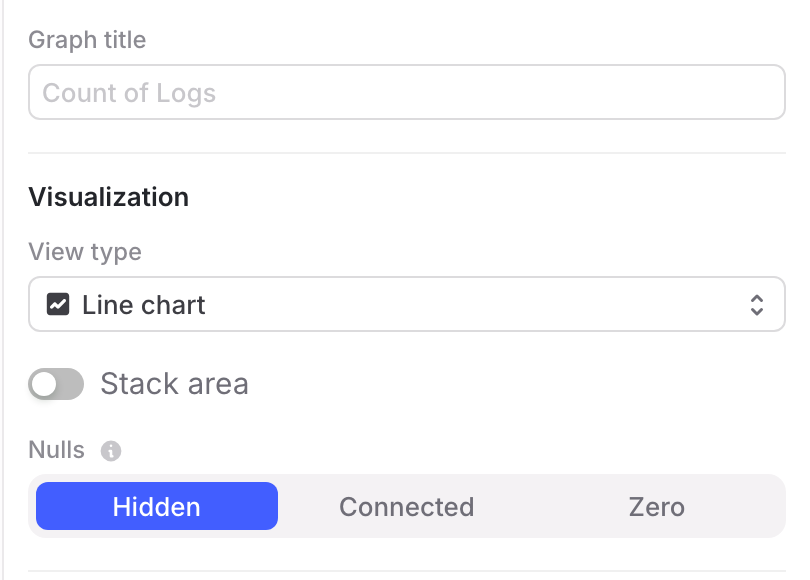
2. Give your graph a human-readable **Graph title**.
3. Choose the "View type" to specify how you want the graph to display data. The options are a line chart, a bar chart / histogram, a table, or a heatmap. To learn how to create a heatmap, read \[Create a heatmap]\(#create-a-heatmap].
4. (Optional) Select how to stack visualizations, which lets you compare amounts from multiple sources.
* For line charts, click **Stack area** to display multiple areas stacked on top of each other.
* For bar charts, click **Stack bars** to display multiple bars stacked on top of each other.
5. (Optional) Specify how to handle **Nulls** or empty values. For line charts, nulls can be graphed as hidden, connected, or zero. For tables, nulls can be displayed as hidden, blank, or zero.
* **Hidden** means nulls are not displayed.
* **Connected** means if two non-empty values have empty or null values between them, the two non-empty values are graphed with a connecting line.
* **Blank** means nulls are displayed as blank rows in a table.
* **Zero** means nulls or empty values are displayed as having a zero value.
Next, build a query to populate the graph with data. Here's how:
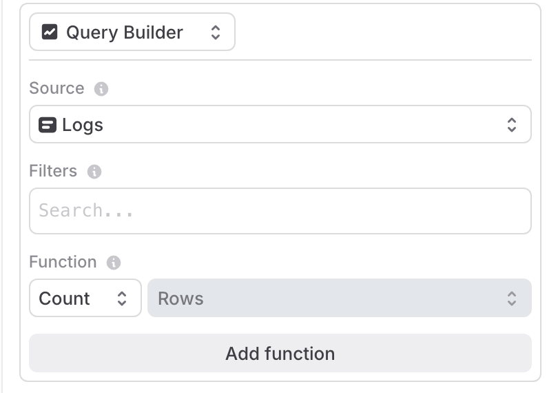
1. Select how to build a query:
* Choose **Query Builder** to use the graph editor UI to query the data for your graph.
* Choose **SQL Editor** to write a custom query with SQL. If you use this option, disregard steps 2 though
2. After you write a query, click **Run query**. To learn more, read [SQL Editor](#sql-editor), below.
3. Choose a **Source** from the dropdown. You can populate each graph with data from sessions, errors, logs, or traces.
4. (Optional) Enter **Filters** to select which data points to include in your graph. For example, if you only want to include data from the production environment, set the `environment` filter. To learn more about the filter syntax, read [Search specification](/home/observability/search).
5. (Optional) Select a **Function** from the dropdown to determine how data points are aggregated. "Count" is selected by default. If you choose a function, such as "Min," that requires a parameter, select the attribute to use as well.
6. (Optional) To add an additional function, click **Add function**.
Then, choose options to group the data. Here's how:
1. (Optional) Enable the **Group by** toggle to group your query results into separate series. Use the dropdown to choose the category by which to group results. For example, you might group your logs by level.
2. (Optional) Specify a **Limit** to restrict the number of groups displayed, and a function type by which to determine if a group should be included in the graph.
3. (Optional) Toggle **Bucket by** to use buckets in your graph. Then select **Interval** or **Count** to indicate how bucket sizes should be determined.
* Bucketing by interval requires that you set a **Bucket interval**. A higher value displays more granular buckets.
* Bucketing by count requires that you set a **Bucket field** and number of **Buckets** to group by.
* For example, you might choose to bucket by **Count** with a **Bucket field** of "Timestamp" if you want to aggregate data points within consecutive time ranges. Or you might choose to bucket by **Count** with a **Bucket field** of "duration" if you want to examine the distribution of latency for a particular API endpoint. Or you might toggle **Bucket by** off to disable bucketing and aggregate data across your entire time range.
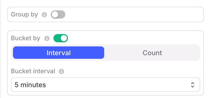
Finally, click **Save**. The new graph appears in the dashboard.
### Create a heatmap
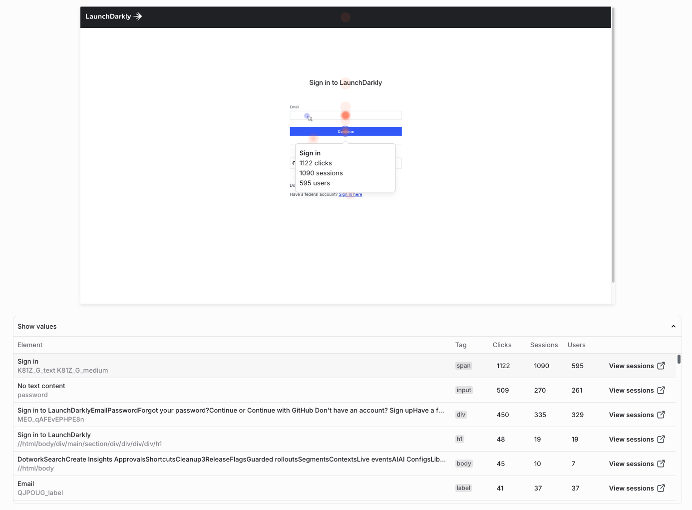
A heatmap is a map of clicks shown over a session background. A heatmap provides a visual layer that aggregates user interactions such as clicks, taps, or scrolls into color-coded intensity maps over your app or website.
You can create a session background for your app or website while watching a session.
Heatmaps help teams understand user behavior across key areas of an application. They make it easy to identify where users most often click or tap on critical workflows, and to find elements that appear interactive but receive little user engagement. Product, engineering, and design teams can use heatmaps to validate the impact of design or layout changes after a release, and to correlate engagement data with feature flags to measure how user interactions change before and after a rollout.
#### Prerequisites
To use a heatmap, you must install and configure the session replay plugin to capture user sessions. Heatmaps are available only with web sessions.
#### Procedure
To create a heatmap:
1. Follow the steps in [Add graphs to a custom dashboard](#add-graphs-to-a-custom-dashboard), above. When you choose the view type in step 3, select **Heatmap**.
2. Select a **URL Path**, which is the URL of the page you want to visualize (for example, your application homepage or a specific product page).
3. (Optional) Add **Filters** to narrow the sessions that appear in the heatmap. For example, you might choose to select sessions by environment, device, or browser size.
4. Click **Save**. The heatmap appears in the dashboard with the session background and click overlay for the selected path.
#### Interpreting a heatmap
The heatmap overlay can identify several types of activity:
* Hot zones (red/orange) indicate areas of frequent interactions or high user engagement.
* Cool zones (blue) indicate underutilized areas or areas with low user engagement.
* Scroll maps visualize how far users typically scroll before disengaging with the page.
Hovering over a zone in the overlay also displays the element name with a numerical count of interactions for the element.
### Advanced graph creation tools
The graph editor provides two advanced graph creation tools: the SQL Editor, which you can use to query data for your graph, and dashboard variables, which you can use to parameterize graphs.
#### SQL Editor
The SQL editor lets you write custom queries to retrieve your data and aggregate as you wish. Using the SQL editor is an alternative to using the graphical query builder.
When you are creating or updating a graph for your dashboard, you can choose **SQL editor** to write a custom query with SQL.
The SQL editor includes the following features and limitations:
* The SQL editor supports the ClickHouse SQL dialect. To learn more, read the [ClickHouse documentation](https://clickhouse.com/docs/en/sql-reference).
* The built-in macro `$time_interval()` expands to `toStartOfInterval(Timestamp, )`. You can use this macro to group results by their timestamp, which makes time series queries easier to write. Here's an example that returns a count of logs for every hour:
```sql title="Example using $time_interval macro" theme={null}
SELECT $time_interval('1 hour'), count()
FROM logs
WHERE service_name='prod'
GROUP BY 1
```
* The dashboard's data range is automatically applied as a filter to all SQL queries. For example, if your graph uses `SELECT count() from logs` and your dashboard's filter is `Last 4 hours`, your resulting graph will only include logs within the last four hours. If you use a `WHERE` clause, it will filter in addition to the dashboard's date range filter, and it will not include results outside that range.
* The SQL editor only supports a single `SELECT` query. However, you can include multiple select expressions. This displays multiple series on your graph. Here's an example that returns an hourly count and average duration of all traces:
```sql title="Example querying multiple series" theme={null}
SELECT $time_interval('1 hour'), count(), avg(duration)
FROM traces
GROUP BY 1
```
* LaunchDarkly stores custom fields and metadata without any type information. You should convert this data to the appropriate type in your SQL queries. Here's an example where your application records a custom integer field to record how many items are in an end user's shopping cart:
```sql title="Example applying type conversion" theme={null}
SELECT email, avg(toInt64(cart_size))
FROM sessions
GROUP BY 1
ORDER BY 2 DESC
LIMIT 100
```
* You can use aliases in your SQL queries so that your data is graphed with custom labels. Here's an example:
```sql title="Example using alias to create custom labels" theme={null}
SELECT uniqExact(email) as "User Count"
FROM sessions
```
#### Dashboard variables
Dashboard variables let you parameterize filters, bucketing, and grouping across multiple graphs. This makes it easier to make changes to sets of graphs at one time. After you create a dashboard variable, you can reference it in any of the filter, function, grouping, or bucketing rules components of the graph editor.
You can create and edit dashboard variables from the dashboard or from the edit page for any graph.
Here's how:
1. From the dashboard or the edit page of a graph, click **Variables**. The "Variables" dialog appears.
2. Click **+ New variable**.
3. Enter a **Name** for the variable.
4. Select a **Suggestion type** for the variable. The following table describes the options:
\| Suggestion type
\| Possible variable values
\| Behavior
| Example |
| - |
\| ---
\| ---
\| --- |
\| Value
\| Any of the possible values for the **Suggestion field** .
\| With a "Value" suggestion, you must also select a **Suggestion field**, which is a search key. The variable's **Default value** is any of the possible values for that key. When you use the variable in a graph, you set the value of the variable using a multiselect with all possible values for that key. A filter resulting from multiple selections is a logical OR of all values.
\| If the **Suggestion field** is "environment," then you can set the variable to any of the environments available in the graph's data. |
\| Key
\| Any of the search keys for the graph's underlying data.
\| With a "Key" suggestion, the variable's **Default value** is a search key. When you use the variable in a graph, you set the value of the variable using a select with all search keys.
\| If the **Suggestion type** is "Key," you can use the variable in function, grouping, or bucketing rules. For instance, you could create multiple graphs in a dashboard that are grouped by a parameterized value. |
\| None
\| Any: the variable's input is free text.
\| With a "None" suggestion, the variable's **Default value** can be any string. When you use the variable in a graph, you set the value of the variable by entering any string.
\| If the **Suggestion type** is "None," this is a freeform variable. You can use it for any function, grouping, or bucketing rules, and there are no restrictions on what value it can hold. |

5. Click **Save**.
6. In any of the filter, function, grouping, or bucketing rules components of the graph editor, reference your variable by entering a dollar (`$`) followed by the variable's **Name**, for example, `$environment` or `$emailAddress`.
## View graph details
For each graph, you can always take a closer look at the underlying data. Here's how:
1. Click **Dashboards** in the left sidenav.
2. Find the dashboard you want to update and click its name.
3. Find the graph you want to examine and hover over its graphed data. A tooltip of the current datapoints appears.
4. Click to freeze the tooltip and show links to the details for each data point:
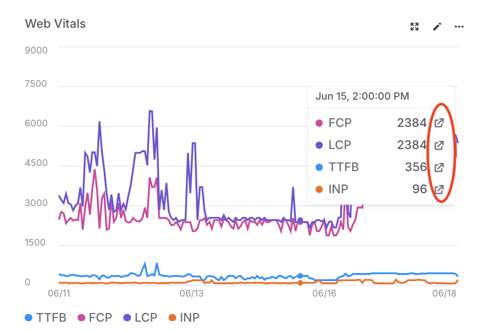
5. Click any of the details links to open a panel with the relevant sessions, errors, logs, or traces. The data points in the panel are filtered using the graph's filters and the grouping, time range, or metric bucket for the specific data point that you selected.
From the detail panel, you can:
* Search the underlying data using the [search specification](/home/observability/search) for the LaunchDarkly observability features.
* Click **Copy link** and share the data with other members of your organization.
* Click a data row to review additional details.
### Manage custom dashboards
After you create a custom dashboard, you can review, update, and share it. You can also add additional graphs or make changes to existing graphs.
#### Share a custom dashboard
To share a custom dashboard, click **Dashboards** in the left sidenav. Find the dashboard you want to update and click its name. From here, you can share the dashboard's data in the following ways:
* To share a link to the dashboard, click **Share**. The URL for the dashboard is copied to your clipboard.
* To share the data behind a particular graph, find the graph and hover on its name. Click the **overflow menu** and choose "Download CSV."
#### Update a custom dashboard
To update a custom dashboard, click **Dashboards** in the left sidenav. Find the dashboard you want to update and click its name. From here, you can make the following updates:
* To update the dashboard's name or default time range, click **Settings**. Make the changes in the "Dashboard settings" dialog. Then click **Save**.
* To add a new graph, follow the [Add graphs to a custom dashboard](#add-graphs-to-a-custom-dashboard) procedure, above.
* To clone an existing graph, find the graph you want to remove and hover on its name. Click the **overflow menu** and choose "Clone graph."
* To remove a graph, find the graph you want to remove and hover on its name. Click the **overflow menu** and choose "Delete graph."
* To update a graph, find the graph you want to remove and hover on its name. Click the **pencil icon** to edit the graph. For more information on the fields you can change in the graph setup, read the [Add graphs to a custom dashboard](#add-graphs-to-a-custom-dashboard) procedure, above.
#### Delete a custom dashboard
To delete a custom dashboard:
1. Click **Dashboards** in the left sidenav.
2. Find the dashboard you want to delete.
3. Click the **overflow menu**.
4. Select **Delete dashboard**.
Deleted custom dashboards cannot be restored.
If you delete a custom dashboard, you cannot restore it. Be absolutely certain you do not need the dashboard before you delete it.
## Viewing flag targeting changes
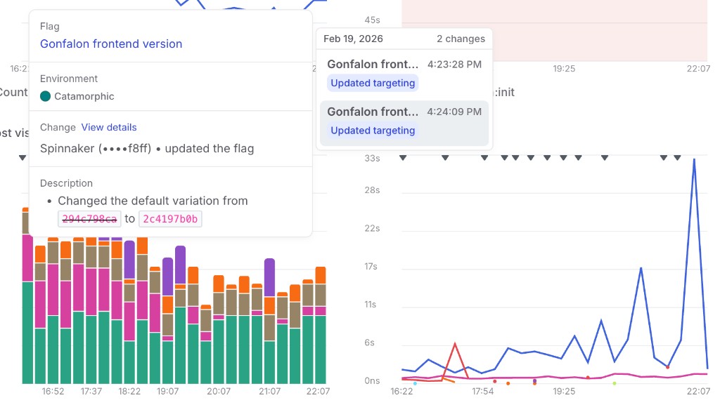
You can overlay flag targeting changes on dashboard charts to correlate feature flag updates with changes in your application metrics. This is available on both default and custom dashboards.
To view flag targeting changes, select one or more flags using the **Flags** dropdown in the dashboard filter bar. Then select one or more environments using the **Environments** dropdown.
When enabled, markers appear on the time axis of each chart at the timestamp of each flat targeting change. If a flag has progressive rollout steps, the steps are connected with a line.
Hovering over a marker displays a tooltip with details about the change. Click **View details** in the tooltip to open the flag's targeting history.